This tutorial is part of a wider series on How To Start A Podcast, a huge range of guides, videos and podcasts dedicated to helping you hit record for the first time. Check out our comprehensive guide to Starting A Podcast and Attracting Your First 100 Listeners to get to grips with the basics.
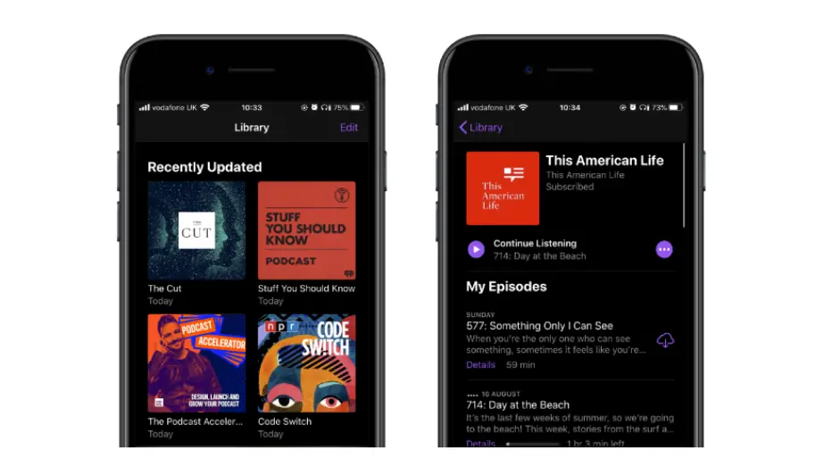
Your podcast logo and cover art are the first thing listeners will see when they’re scrolling through apps – it’s got the tough job of communicating what your show is all about without relying on cliches. Look at your favourite listening app now – all the podcast artwork is tiny, isn’t it? In this article, we’ll teach you how to design great artwork that translates to a super small scale, why your art is so important and show you some great examples to consider.
In this article...
5 Podcast Artwork Mistakes And How To Avoid Them

Download 5 Podcast Artwork Mistakes To Avoid right now,
for free!
"*" indicates required fields
100% secure. We never share your email
First impressions count with your podcast artwork
When it comes to podcast artwork first impressions count. They really, really do.
Let’s say you have a cracking podcast. You’ve picked a really interesting subject, the chemistry between the hosts is electric and you’ve bagged yourself some amazing guests. That’s all that matters right?
Wrong. Having all of the above is great. However, if not much thought has gone into your podcast artwork, how are you going to draw new listeners in and stand out amongst the myriads of other podcasts in your category?
You may be thinking, “Well, I’ve already designed my podcast cover art… I am not 100% happy with it but surely it doesn’t matter that much, right?”
Yes, it does matter. And just because you have gone with a design already, this doesn’t mean you have to stick with it.
Whether you’ve yet to launch your show or are reconsidering your podcast cover art, this tutorial will help you to understand and appreciate the importance of designing podcast artwork that doesn’t, well, suck, and give you some tips for creating a masterpiece of your own.
Podcast Logo vs Podcast Cover Art – What’s the Difference?
First things first, let’s clear up something important.
Lots of people make reference to ‘podcast logos’ when they’re actually referring to podcast cover art. There’s a big difference between these two terms: your podcast cover art refers to the artwork you upload to the directories. It’s how you represent your podcast visually at a glance and is how listeners will discover your show.
Your podcast logo is one element of your wider podcast brand system. Yes, your logo is also a visual representation of your podcast (like your cover art), but a logo can be applied more flexibly across a wide range of materials to identify your brand. You might create a logo if your podcast will one day be part of a business, or if you want to make merch.
You don’t have to have a podcast logo in order to create cover art, but you can use the approaches in this guide to help you design both those visual elements for your podcast, if you like!
Why is it important to create a good podcast cover?
Great podcast artwork, where it’s obvious that hosts have put in the time and effort, can be the difference between 20 regular listeners and 300 new listeners per week.
Yes, really: our friends at The Podcast Host saw a jump from 26 to 1928 downloads when their podcast was featured on Apple Podcasts’ New & Noteworthy page and there’s no chance you’ll be featured anywhere with bad cover art.
- First things first – you need cover art in order to submit your podcast to the major directories. No ifs, no buts.
- No matter what topic your podcast falls into, there’s likely to be hundreds of other podcasts competing for listeners’ attention. At the same time: listeners’ attention spans are getting shorter, so you want to stand out from the get-go.
- Your artwork is the first thing many listeners will see when they come across your show, and is an important first indication of the quality, tone and content of your podcast. It’s a bit like curb appeal, but for audio.
- When people are scrolling through podcasts, they are met with a sea of different colours, shapes and fonts. The trick is to make yours different so it catches the eye of scrollers and makes them curious enough to click. That’s what we’re aiming for – a click-through from prospective listener to then go ahead and try your podcast.
Your Guide To The Best Podcast Cover Art and Logo
Now we’ve covered what podcast cover art is and why it’s important, it’s time to give you the details on how to make the best podcast artwork yourself.
Podcast Artwork Specifications for Apple, Google and Spotify
Before getting into the dos and don’ts of podcast design, we first need to talk about size.
Yes folks, forget what you’ve heard… size DOES matter, well when it comes to your podcast cover art, anyway.
Being on Spotify, Amazon Music, TuneIn and other podcast directories, is a great way to grow and reach new listeners. However, Apple Podcasts (what used to be iTunes), is by far the most popular directory.
With it being the most popular it only makes sense to make sure you first and foremost adhere to their sizes and dimensions.
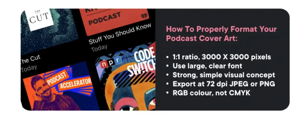
According to Apple’s specifications, podcast artwork must adhere to the following:
- 1:1 ratio, between 1400 X 1400px (minimum) and 3000 X 3000px (maximum, and preferred by Apple)
- 72 dpi (dots per inch)
- In either JPEG or PNG format (with PNG generally being higher resolution and therefore quality, but bigger file size. We recommend JPEG!)
- Have the appropriate file extensions .jpg or .png
- RGB colourspace, not CMYK
Spotify requires identical specifications.
Some other important factors to consider:
- Apple also recommends optimising the cover art for mobile by compressing the image size – under 500KB is optimal. When you upload episode artwork with Captivate, we’ll make sure your artwork complies by giving you a heads up if it’s too big or doesn’t meet the criteria! You can also check that your cover art meets the specs ahead of time by using a feed validator, like CastFeed.
- Don’t place elements or text too close to the edges of your artwork. Leave a generous margin to avoid clipping or obscuring by play progress bars.
- Don’t use explicit language or imagery.
Optimize Your Podcast Artwork For All Devices
Next you need to make sure your artwork works in a variety of sizes from large monitors to smaller phone screens AND everywhere your artwork is shown within a podcast directory.
To make sure your podcast artwork looks great at all sizes, export it at 50 x 50 pixels as a test. If any element looks off, or is too small to read clearly, you should rework it.
Another article we think you'd like...
Reading Time: 5 minutes Designing your podcast logo and artwork? We’ve got you covered! Here’s the best logos and cover art to help get those creative juice flowing!
This is because on a cell phone, your podcast artwork will be considerably smaller, so prioritising legibility and simplicity will pay off.
Don’t forget about dark mode. Plenty of operating systems, extensions and apps now have the option to toggle on dark mode. Think about how your cover art will display against a dark background – don’t let your podcast disappear into the shadows (literally!)
Design For Potential Changes Down The Line
Make sure your podcast artwork can be easily scaled up and down without losing detail or legibility. Why is this important?
Back in the day, the recommended size for podcast cover art (across the board) was 300 X 300 pixels. It’s now 1400 X 1400 pixels minimum.
That’s a pretty big jump right?
Directories have increased it before and may do it again, so to be safe when designing your cover art, have the maximum dimensions in mind: 3000 X 3000 pixels.
We recommend having a high resolution version of your podcast cover art that you can resize anytime. That way, if the directories change up the specs, or if websites/other podcasts feature your cover art, your artwork will still look A+.
Remember, You Can Always Change Your Podcast Cover Art
Unlike dogs, your podcast cover art is not for life. If you grow out of it or want a makeover down the line, you can change your podcast artwork extremely easily.
Your artwork is included in your RSS feed, which means any update will automatically pull through with the rest of your podcast details, like name, description and episodes.
How to Change Your Cover Art in Captivate
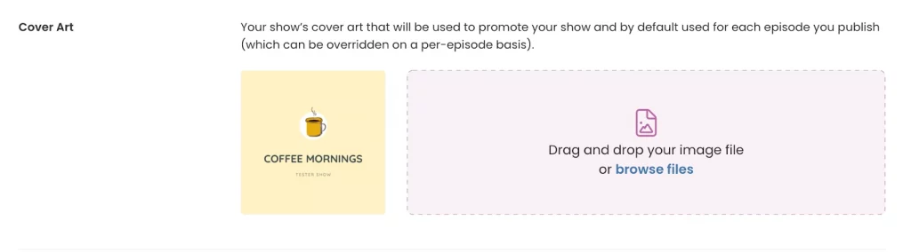
- To update your cover art in Captivate, just head to ‘Podcast Settings‘ at the top of the dashboard.
- Select your new art from your files, or just drag and drop one.
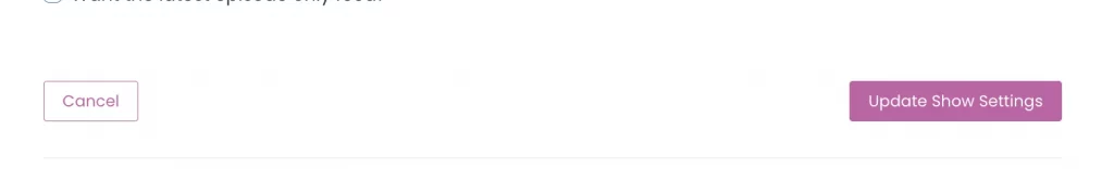
- Scroll down to the bottom and select ‘Update Show Settings‘.
5 Do’s When Designing Your Podcast Cover Art
Moving on from size, what are some dos when designing your podcast cover art?
1. Be Clear What Your Podcast Is About
First up is being clear about what your podcast is about. What is the main topic of your podcast or main themes? Jot these down and have a think about ways in which you can incorporate these into your cover art (or logo).
For example, is there a symbol that is recognizable for your topic? For example, the dollar, pound or euro sign for finance. How could you incorporate that into your design?
Alternatively, if it’s a podcast about social media, can you use different social media icons in a creative way?
2. Think About Your Audience
When designing your cover art, always have your audience in mind. Who are you trying to attract with your podcast?
This is a b of an obvious example, but say your podcast gives tips to first time dog owners, it wouldn’t make sense to use a picture or illustration of a cat.
Similarly, if you have a podcast about graphic design, if your artwork isn’t aesthetically pleasing or showcasing impeccable design ability, you’re not going to attract designers (rather, their scorn).
3. Think Carefully About Using Either A Photo Or Drawing
Unsure about using a photo or drawing for your podcast art? Well, it all depends on what you are trying to depict.
Photos depict something real and gives the sense that your podcast is journalistic. You usually see podcasts about news, politics, finance etc using photos instead of drawings and illustrations.
Saying this, you have more flexibility to be more creative if you decide to go down the drawing route. We tend to see that edgy, fun and ‘hip’ podcasts decide to use drawings or illustrations.
It all depends on the message and tone you want to convey. Going back to point two, who is your audience? What will draw them in best: a photo, illustration, or typography?
There’s also the argument of being different to your competition and other podcasts. If the majority of podcasts similar to you use a photo, be different and opt for illustration or typography instead.
Top tip: If you want to use a photo or illustration, make sure you opt for royalty free stock images, create your own or credit the designer wherever necessary. Sites like Unsplash, Pixabay, Pexels and Freepik have huge catalogues of free stock images, or you can pay for one using Shutterstock.
4. Think About Where Else Your Logo or Artwork Will Be Used
The likelihood is that your podcast artwork won’t just be used within the podcast directories. You’ll be using it in other places such as on social media, the header or footer of emails, business cards, flyers and your website.
For consistency of your podcast brand, you want to be using the same logo and visual theme everywhere that your podcast is mentioned, so when coming up with concepts make sure you pay attention to flexibility, adaptability and accessibility too!
5. Think Carefully About Style
In design there are the basic elements such as line, colour, shape, space, and texture. How can you use these elements to create the right style for your podcast artwork?
Another article we think you'd like...
Reading Time: 5 minutes Designing your podcast logo and artwork? We’ve got you covered! Here’s the best logos and cover art to help get those creative juice flowing!
Line and shape are pretty restrictive as you don’t have a lot of space to play with and the shape has to be a square.
However, what you can play with is colour, space and texture. Use colours that pop and complement each other, and play around with space and texture to make sure people’s eyes are drawn to the most important places of your design first.
Top tip: Be careful with texture! For example, don’t go crazy with shading on letters, as this will make it hard to read on smaller screens.
5 Podcast Artwork Mistakes And How To Avoid Them
Download 5 Podcast Artwork Mistakes To Avoid right now,
for free!
"*" indicates required fields
100% secure. We never share your email
4 Don’ts When Designing Your Podcast Artwork
What are the don’ts when it comes to designing podcast cover art and logos?
1. Don’t Be Afraid Of Simplicity
Don’t be afraid of simplicity, instead embrace it. You may be thinking, I’ve got a small space to try and do A LOT with. This is not the case.
When it comes to podcast cover art, less is definitely more. You don’t want to end up with artwork that is overly complicated or too busy. This will just cause headaches and confusion for your potential listeners, as well as being a legibility nightmare. Here are some key takeaways:
- Make sure that the background doesn’t obscure the other elements of your design
- Keep it big, clear, simple and legible
- Don’t use too many words or cram on too much information
- Step well away from your screen – if you are having trouble reading any one element of your design, rethink it
- Don’t Go Overkill With Fonts
Getting the fonts right for your logo or cover art is important. Don’t get too excited and go overkill with multiple different fonts which are heavily stylised and make your cover hard to read.
Again, stick to simplicity and remember the tone you’re going for. The font you choose should complement the whole design and not take over.
For some podcasts, it might make sense to lead with typography – for example, if your podcast’s subject is history or references an era in pop culture. This makes for a clever, distinctive nod to your subject matter and is a really good differentiator when browsing the directories.
Top tip: Not all fonts are royalty free! It’s really important to pay attention to font licenses or use free fonts wherever possible to avoid getting into trouble. As a rule, Google Fonts and Adobe Fonts allow you to use their typefaces without having to purchase a license. Similarly, the fonts you’ll find on Canva will be royalty free.
2. Don’t Let Limitations Get In The Way Of Creativity
Don’t let the limitations and restrictions get in your way of creativity. Yes, there’s not a lot of space to play with and it also has to be a square, however, embrace the challenge and get really creative.
Limitations help you to focus and make sure you are only adding design elements that are really necessary to help promote your podcast and get the right message across.
You will be pushed to your design limits but use this to create something truly special, that you are proud of.
3. Avoid Overused Icons!
Don’t be boring and pick overused icons in your design such as a headphone or microphone. This won’t help you to stand out. Instead, you’ll end up blending in with the other podcasts.
If you absolutely have to, think of ways that you can use these icons in a fun and interesting way.
The trick is picking icons that make it obvious what the podcast is about but staying away from ones that have been used by hundreds of other podcasts.
Try to be unique and different.
4. Don’t Be Afraid Of Colour
Embrace the use of colour: don’t be afraid. One sure way that you can stand out from other podcasts is by injecting a little bit of colour into your cover art. The trick is to use bright and inviting colours, but still picking shades that complement one another.
People are physically, psychologically and socially influenced by colour, so use this and be clever with the colours you choose.
Remember, Captivate’s podcast websites and players pick colours from your cover art/logo for consistent branding across all your online touchpoints!
Where to make podcast cover art
When designing podcast covers, you can either go down the paid or ‘DIY’ route – the latter of which is free.
Creating Podcast Artwork For Free
If you have a limited budget, use the tips in this tutorial and create your podcast logo and cover art yourself.
There are many design tools that you can use to create your artwork. You have software such as Adobe Photoshop and Adobe InDesign, for the more seasoned designers. However, if you are a design novice and not too familiar with Adobe’s design tools, fret not, here are some free options:
Canva
FREE, with ‘Pro’ account and advanced features available from $12.95 per month
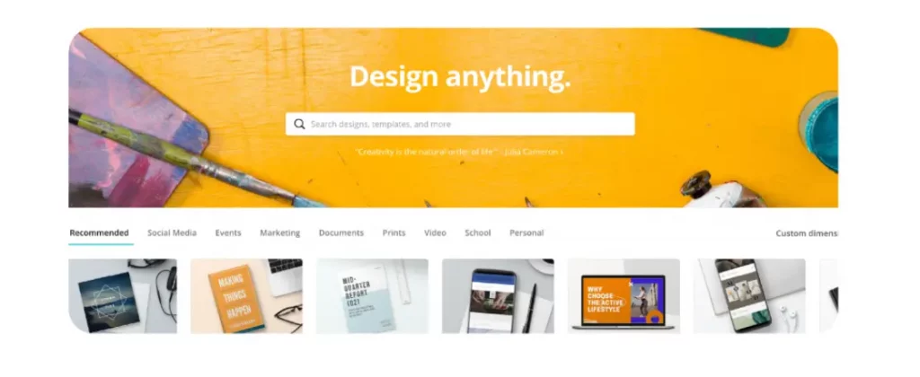
Canva is a very easy to use graphic design platform that allows users to create a range of different visual content, including dedicated design templates for podcast cover art as well as a logo maker too!
Another article we think you'd like...
Reading Time: 5 minutes Designing your podcast logo and artwork? We’ve got you covered! Here’s the best logos and cover art to help get those creative juice flowing!
What we especially love about the tool is the huge bank of templates, stock images, fonts and illustrations at your fingertips.
You can set yourself up with a free or paid account. With the paid account you get more features such as premium images and illustrations, more templates, the ability to upload your own fonts and logos, set style guides, manipulate images and more.
Appypie
FREE, with pro plan for $6/month
Another simple, free to use option is Appypie, a no-code development platform – you can create a logo or artwork in a huge variety of sizes. This includes Instagram and Twitter sizes, which are perfect for podcast art.
The free plan limits you to 4 projects and some design templates are hidden behind paywalls, but there’s more than enough functionality there to help you create a great, professional quality piece of artwork for your show. It will also remove backgrounds from your photos for you!
You can remove all restraints for $6/month, and the app has some great NFT options if you want to branch out into that direction.
Paying To Have Podcast Artwork Designed Professionally
If you have the budget to get podcast logo and cover art designs created professionally, we would definitely recommend going down this route, as it will definitely be worth it in the long run.
When you are being shown concepts from your designer, you can take into consideration what we have covered in the blog to help you pick the winning design.
How Much Does Podcast Cover Art Cost?
If going down the paid route is the better option, you may be thinking, “how much does it cost to get it done professionally?”
You’re probably going to hate this answer, but this really depends on who you use. For example, if you use a freelancer, this is typically going to cost a lot less than an agency.
When it comes to design, you get what you pay for. However, you don’t necessarily have to spend hundreds to get quality podcast artwork.
For example, there are websites such as 99designs and Fiverr which allow you to submit a brief to a community of designers, and then they will bid for your work or you can use a dedicated company such as The Podcast Design Company to do the work for you.
The Podcast Design Company
Packages from $147
Nothing beats personal service and when it comes to podcast cover art design, it’s important that you can really communicate your brief well (if you need help with that, there’s a template in our podcast launch crib sheet) so that your design fits you and your podcast brand.
The Podcast Design Company works with podcasters all over the world to produce stunning custom podcast cover art to fit any budget and, with all of the source files provided, you’ll have everything that you need to scale your podcasting brand in the future.
99designs
Prices between $299 – $1,399
99designs offers 4 fixed packages to suit any budget and project. The difference between the cheapest and most expensive package is the amount of design concepts you’ll receive, access to their ‘top level’ designers and better support such as a dedicated account manager.
You can commission pretty much anything design-related on 99designs, from entire design systems (including logo, cover artwork, website design and more), to just your cover art itself. Here’s how it works:
- Choose your project and fill out your brief in as much detail as you can
- Choose your price bracket to start a contest or pick a specific designer
- Receive your concepts back from the designer(s)!
Fiverr
Prices between $5 – $995
Projects on Fiverr begin at $5 per job – hence the name. Saying this, designers on Fiverr typically charge more than a $5, but know that you’ll get a high quality, professionally designed result that you can apply across your whole podcast brand (so well worth it).
To commission your project:
- Sign up for an account
- Use Fiverr’s search filter to find the right freelancer
- Check out their portfolio
- Choose the price that best fits your needs!
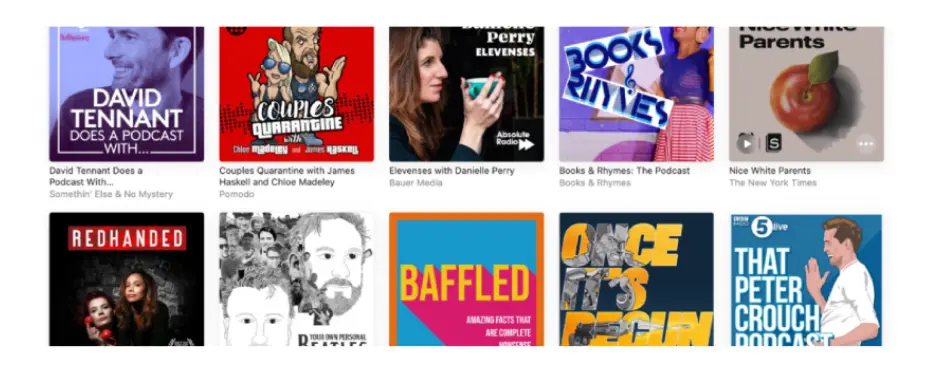
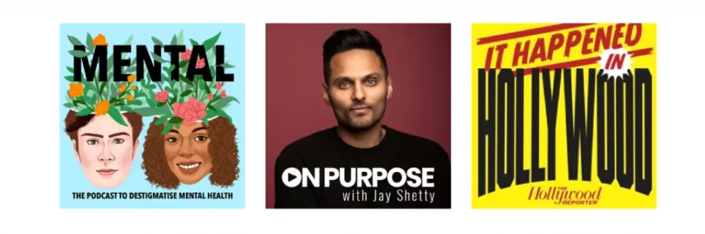
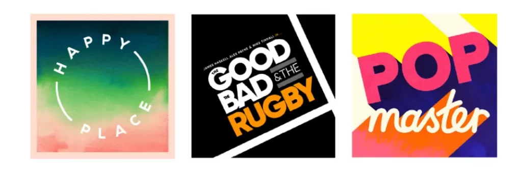
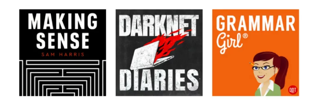
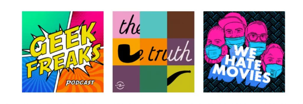
5 Examples of Our Favourite Podcast Artwork and Why It’s Good
Now you’re armed with 5 do’s and don’ts when it comes to designing podcast artwork, it’s time to get into some real life examples of the most effective podcast cover art we’ve come across and explain why we think they nailed it.
So, we headed to Apple Podcasts’ New & Noteworthy section and picked out the top 5 most appealing covers based on looks alone – because that’s what listeners browsing will do, too. Here’s what we chose:
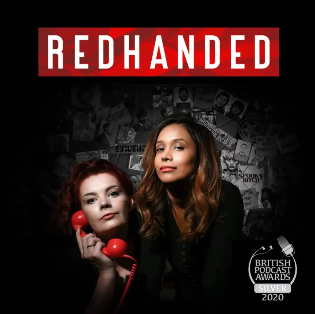
Redhanded
Category – True Crime
Why Is This Podcast Cover Good?
- Simplicity – It’s not cluttered and will be clearly legible on smaller devices.
- Name – The name of the podcast jumps out because of the font used and the contrasting colours.
- Use of a photo – They have opted for a photo of the hosts rather than illustration which depicts that this podcast is about something real. This makes sense for the category they are in (true crime).
- Award – The award badge in the right of the logo helps show the integrity of the show and convince people to check them out instead of other shows – who of course are their competitors.
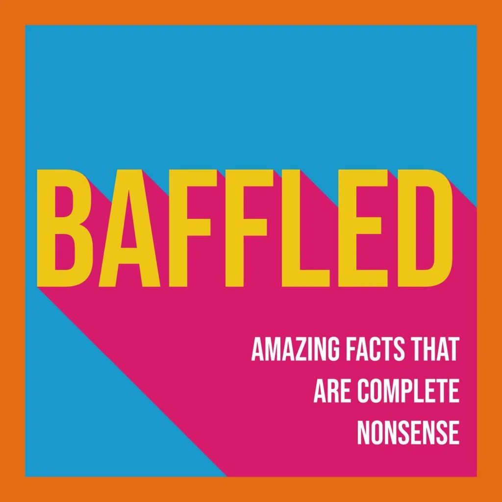
Baffled
Category – Comedy
Another article we think you'd like...
Reading Time: 5 minutes Designing your podcast logo and artwork? We’ve got you covered! Here’s the best logos and cover art to help get those creative juice flowing!
Why Is This Podcast Cover Good?
- Colours – Bright, eye-catching, appealing colours nod to the light-hearted, curious tone of the podcast.
- Clear topic – A short tagline in the bottom right makes it obvious what the show is about.
- Simplicity – This is a well balanced cover that creates a clear hierarchy and draws the eye into the key information: the name!
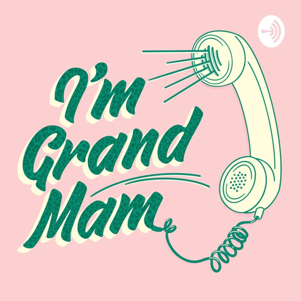
I’m Grand Mam
Category – Comedy
Why Is This Podcast Cover Good?
- Visual theme – Their vintage/retro theme conveys a lot about what this podcast will be: tongue in cheek, comedic and discursive.
- Icon – They have used an icon that helps tell people what kind of content and tone they can expect.
- Font – The font is more stylised and that works well with the overall theme. Whilst it’s stylised, they have prioritized legibility and you can still clearly read what it says.
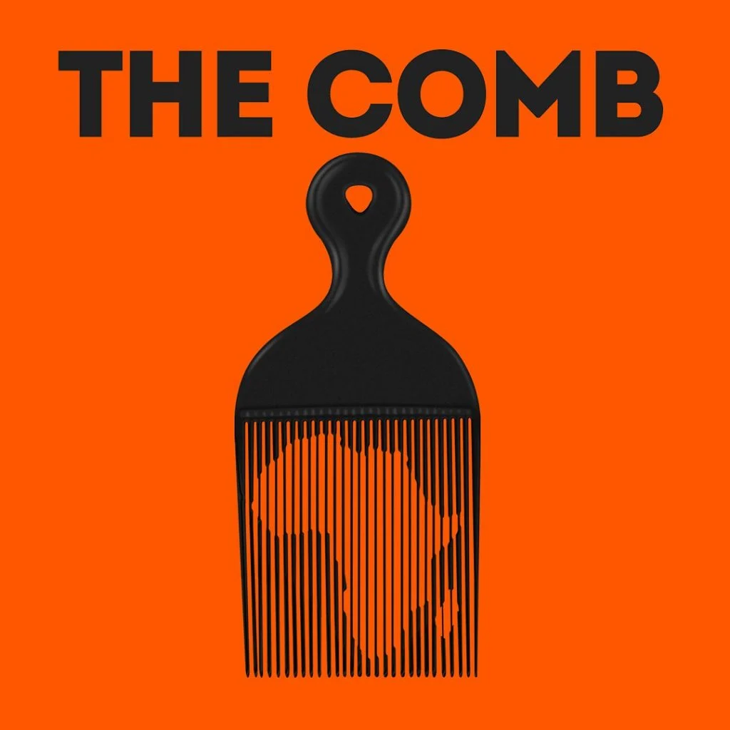
The Comb
Category – Personal Journals
Why Is This Podcast Cover Good?
- Colours – The black writing on a bright orange background really stands out. This cover would definitely catch someone’s eye when browsing a category in a directory.
- Illustration – A really clever use of illustration which is a clear representation of the content of the podcast: individual narrative stories from the continent of Africa.
- Font – The font is a strong sans-serif, which is clearly recognizable from a distance and can be scaled down without losing legibility.
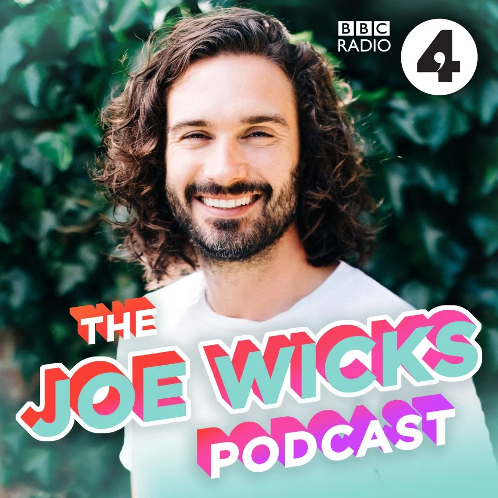
The Joe Wicks Podcast
Category – Health and Fitness
Why Is This Podcast Cover Good?
- Photo – Use of a photo rather than a drawing helps to depict something real and trustworthy. This podcast is about health and fitness, so this makes sense. Also, Joe Wicks is a familiar face here in the UK, so it makes sense to use a picture of him.
- Font – If you are familiar with Joe Wicks, you’ll know he has a cheeky and fun persona, so it makes sense to set the title in bold, dynamic typography such as this.
- Colours – This cover is using very bright and breezy colours. Most of the design is green which relates to health and fitness. Also, the contrasting colours in the title help the title stand out.
Podcast Cover Artwork FAQs
- What colors are best for podcast covers?
There isn’t really an answer that’s applicable for all podcasts – instead, think of what kind of vibe your podcast has, and which colours suit that. Red has connotations of danger, alarm and seduction, orange could be warmth or autumn. Think about what you want your listeners to feel, and make it happen.
- Should I put my face on my podcast cover?
Unless you’re famous or trying to build a personal brand around yourself, it’s probably better to go with some kind of icon which symbolises your niche or topic. Space is a premium in a podcast logo, and the more you can communicate about your show the better.
- What is the best font for a podcast cover?
Again, there isn’t one specific font that’s always best, but make sure it’s legible at small sizes – remember, most people will be seeing a tiny version on their phone. That said, probably avoid comic sans.
- Where do I use podcast cover artwork?
You upload your cover art to your host and then we push it through to your website and all the directory apps. It’s then visible to everyone who comes across your show.
- Where do I use podcast logos?
Your podcast logo is a little icon, usually part of your podcast artwork. It should signify what your show is about.
Takeaway
Your podcast cover art is the first thing potential new listeners see when they come across your show. First impressions count, so it’s important to make an impact with a simple, eye-catching design that works as well at the size of a stamp as it does on the largest desktops.
With your cover art designed, you can now think about how you can adapt and apply your new visuals throughout your social media posts, your podcast website and players for optimum podcast brand visibility!
If you want feedback on your cover art, or need help deciding what to go for, join our dedicated podcast launch Facebook group where you can connect with over 3000 other podcasters.
5 Podcast Artwork Mistakes And How To Avoid Them
Download 5 Podcast Artwork Mistakes To Avoid right now,
for free!
"*" indicates required fields
100% secure. We never share your email